Today, a business card is an interesting and useful symbiosis of advertising, an effective way of psychologically influencing a person, and fine art.
In modern society, advertising is one of the few industries that allows you to introduce people to beauty and make money from it. Therefore, the main task of a professional designer is not just to create aesthetically attractive business cards, but also to make them an effective marketing tool that brings considerable profit to the customer.
The world of advertising information is literally oversaturated with various slogans, appeals, requests and advice. Therefore, it is quite difficult for a start-up company to stand out qualitatively in this abundance. This goal can only be achieved with the help of inventive, competent and clearly thought-out work of designers, marketers and advertising specialists.
Only an experienced and qualified designer is able to create a unique business card layout, taking into account all the requirements and wishes of the customer, and the psychological mood of the future target audience. It has been proven that it is the design of a business card that is primarily appreciated and remembered by the consumer. It is logical that it is in the customer’s interests to do everything possible to ensure that the first impression of his company or services is positive. In addition, the arsenal of modern technological and graphic capabilities is almost limitless. Therefore, designers have everything they need for high-quality and productive work. Therefore, before ordering business card printing, you should definitely consult with professionals about the color scheme and the general design of your business card.
Where should you place your initials?
The owner's name should stand out from other data. According to Feng Shui, in order to avoid interference when moving up the career ladder and at the same time not to perform an excessive amount of work, your last name and initials on the business card should be placed like this:
- above the company name or at the same level as it;
- slightly shifted to the right relative to the center of the card;
- letters of the same size as the name of the institution or larger;
- the font of the name should be easy to read, the letters should look stable, standing freely, so as not to create the impression that they are squeezed or constrained;
- Sharp corners (“poisonous arrows”) of the logo, which harm the Chi energy, should not be directed at the initials.
According to Feng Shui, the name is not enclosed in a circle or oval. On a card printed in a foreign language, the patronymic name is not indicated. Under the name there should be information about your position or social status.
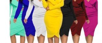
Personal business cards (not tied to a company) can be designed in either a spectacular or a strict style, but the information in them is always concise. Recommendations that will bring you prosperity: place your first and last name in the very center of the card, type of activity and contact phone number below them.
Black
The absence of color can have a relaxing effect. At the same time, a black business card creates an atmosphere of mystery and generates a desire for the unknown.
Choose one or more colors that match both your business and personality. Remember that business cards not only represent you and your company, but also become part of the brand concept. They influence how people perceive you and can encourage collaboration.
Based on an article from the Printplace printing house website
Where is the logo placed according to feng shui?
The examination of documents begins in the upper left corner, so the company symbol is placed there. The best logo option is rounded elements, letters depicted without tilting, not pressing on each other, and a background symbolizing stability and security. The negative impact of sharp elements of the logo is eliminated by enclosing it with a circle or ellipse, otherwise it can provoke a wary attitude from customers.
If local representatives of a large company want to present 2 logos on a business card - theirs and the main one, the data is placed like this:
We have selected interesting articles for you:
How to choose furniture for the manager's office
30.06.2021
Arranging your desk according to Feng Shui
26.01.2019
- in the upper left corner - the logo of the main company;
- below it is the logo of the branch or subsidiary.
It is important to design the business card so that all the colors of the company logo are reflected on the business card.
Types of perception, their main goals and meanings
This factor shows that the more saturated the color, the stronger the impression it makes on a person. Therefore, to create emotional, rich and memorable business cards, it is recommended to use rich shades. For calm, affirmative options, slightly saturated tones are better suited.
Another important aspect is the outlines and contours of the figures depicted on business cards. Smooth, rounded, smoothed elements create a feeling of reliability, confidence, and security. And vice versa - the presence of sharp cuts, sharp bevels can provoke alertness and even aggression from clients.
Composition is the correct arrangement of objects on the working area of a business card. There are standard and original compositions, and their choice depends on the goal that the designer is trying to achieve.
The technique of depth in business card design is used quite rarely. But its correct use can place the right emphasis on perspective and expand the space available on a sheet of paper.
The style of the business card is determined by the general appearance of the image, color and character of the lines. The main thing is to adhere to the main rule of style unity so that all elements of the composition are visually combined with each other.
When developing an exclusive business card design, you need to try to use objects that a potential client will associate with the proposed service sector. Some creative designers, on the contrary, try to find indirect associations. Such business cards look much more interesting and attractive.
All of the above features of the perception of business card design can qualitatively increase the efficiency of its use, and, accordingly, bring the expected benefits to the customer.
- Perception by saturation.
- Perception by volume and shape.
- Perception by composition, style and depth.
- Perception by association.
Business card color
Most cards are printed on a white background, which is considered the basic background. The text and graphics on it are clearly visible, and its price is lower. But according to Feng Shui, the color of a business card to attract customers should be chosen depending on the type of activity. Of the 5 elements of teaching, each element corresponds to a specific color palette and occupation.
People working in the following areas can use predominantly red shades of the Fire element (up to orange) in the design of business cards:
- oil and coal industry;
- television and electronic services;
- advertising and marketing;
- show business, organization of holidays;
- modeling;
- photography, stylistics.
Red color burns the excess zone, encourages action, orange clears the mind of unpleasant emotions. They are used both for the background and to highlight inscriptions.
The colors of the element Water - blue, indigo and black - are suitable:
- sailors, fishermen, workers of ports, boat stations - everyone related to water;
- journalists, presenters of radio and television programs;
- employees of travel companies;
- producing and selling drinks;
- actors.
Shades of blue have a calming effect, and black has a special grace and contrasts favorably with other colors.
The colors of the element Wood - all shades of green - are suitable for business cards employed in the following areas:
- textile industry;
- design, art;
- pedagogy;
- forestry, floriculture and plant growing;
- phytotherapy.
Green tones balance and represent naturalness. The colors of the Earth element - yellow, brown, mustard - would be appropriate on a business card:
- builder;
- realtor;
- lawyer, notary;
- accountant, financier;
- livestock breeder;
- merchant.
These shades are realistic, stable, and credible.
Colors of the element Metal - white, silver, copper, golden, gray. It is recommended for those who work in the following areas to design their business cards in these colors:
- production, repair and maintenance of automobiles;
- production and sale of electrical equipment;
- music and natural history;
- banking
Business cards made on metallic paper - with a shimmering metallized surface - will contribute to the activities of people of these professions.
A business card can consist of one color of different saturation, and also combine several different shades. But to make it look harmonious, it is not recommended to use more than 5 colors. Inscriptions made on a dark background and ornate font are not conducive to business communication and the assimilation of information.
The influence of the color of an object on its perception
The famous Swiss researcher and psychologist Max Lüscher proved back in the last century that the color of a product or object affects a person’s perception of it. As a result of many studies and scientific works, he came to the conclusion that each color from a huge palette evokes a certain range of emotions .
Luscher identified four primary colors that are most capable of causing a psychological reaction in a person: blue, red, yellow and green. Other, “mixed” colors also have their own spectrum of influence - burgundy, purple, orange, brown.
When developing a business card design, it is important to take into account its main purpose, the mood that needs to be evoked in a potential client. Based on these considerations, its color design is chosen. So, to create a business-like, seasoned card, it is recommended to use cold colors, and for a more emotional, “lively” card, warm colors.
Printing business cards to order at a price of 2.5 rubles/piece.
Any printing methods and circulations. Delivery possible.
Order
Feng Shui business card size
The standard size of business cards 90x50 mm is convenient. According to Feng Shui, the number 50 brings joy and tranquility, while the number 90 brings destruction. Lines or patterns on a business card will help you maintain proportions and attract Qi energy; they will divide a segment of unfavorable sizes, and then instead of one negative there will be 2 that carry a positive. At the same time, it is important to rely on such imperial dimensions, which improve the course of affairs:
- 0-13.5 mm – will bring profit;
- 13.5-27 mm – wealth and security;
- 27-40.5 mm – 6 types of luck;
- 40.5-54 mm – happiness and abundance.
The dividing lines do not have to be flashy, although red ones will exclude an unnecessary area from the total area.
In accordance with the specified imperial sizes, you can order business cards smaller than the standard.
Brown and yellow
Element – earth. These business card colors are suitable for specialists in real estate, trade, construction and livestock farming, as well as for those whose work involves the processing and distribution of documentation.
Similar articles
- Business cards for computer help (computer repair) - examples and prices
- Dental business cards. How to make a business card for a dentist
- Business cards for an electrician - samples and rules
- Business cards for car wash, tire service and car service - samples and rules
- Business cards for funeral services - samples and rules
Our partners
How to choose a color for a logo
While conducting research on the impact of color on customers, an excellent infographic was obtained. It will be useful to analyze it; it allows you to choose the most suitable color scheme.
If you intend to use more than one color, you should find a harmonious combination so that the shades interact well with each other without causing conflict. It is better to resort to special services where you can choose the optimal solution from ready-made options, of which there are a huge variety. There are also sites where you can create your own diagram interactively.
Conclusion
A modern business card is an extension of a brand's personality. It helps you make a first impression, get to know the company better, and differentiate it from competitors. To create a trendy design, be inspired by the trends that we talked about in the article, but do not forget about minimalism.
Published byNatalia Shpitula Updated June 8, 2021 Posted inAll about design
Blog editor at Logaster, content marketer. Web marketing and branding expert. He knows how to write simply about complex things. Using her articles, you can build a successful brand and start successful promotion on the Internet.
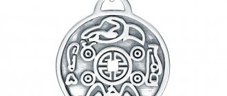
Elemental symbols for business cards
- Water (liquids): curved, wavy or arched lines (representing a wave or liquid); turtle, dragon and fish
- Fire: flame, phoenix, triangle, horse and rooster
- Metal: shield, disc, stone, gold bar and coin.
- Wood: lotus flower, trees, bamboo, tall cylindrical shapes and columns.
- Earth: oval, circle, ceramic and crystal.
There are other symbols used in industry that relate to the five elements, such as: a faucet with a drop of water, a welding torch, a lumberjack cutting wood, a bulldozer moving an earthen mound, and so on.
Rule two. Good paper
An important point is the paper on which your business card is printed. It should be dense and comfortable to write on. You already know what the back of your business card is for, right?
Many people use embossed paper to make business cards. Try writing something on it first. It turns out, to put it mildly, not very well. Therefore, for personal and corporate business cards, choose paper on which you can easily scribble a few words with a pencil, ballpoint pen or pen, if you have a Parker fountain pen in your pocket. Leave the gloss and embossing for advertising business cards.
Business card graphic design
Adding interesting graphics on a topic is a pretty interesting move. But you should exercise some caution and adhere to certain rules:
- Do not make the graphics too bright and large;
- You should not put your own photo on the business card;
- You should not duplicate the text of the business card in the graphics;
- If it's a logo, don't place it below the text.
Remember, all the basic information will be printed on the business card. Graphics make it possible to add additional information and turn this small piece of paper into a real information field. Make the most of this opportunity. The main rule when choosing a background pattern is restraint, otherwise the key points will be lost against the backdrop of bright colors and complex images.
Business card design is a real art, the background of which plays a major role in the success of your business. You either declare yourself loudly and confidently, or you remain at the level at which you decided to print business cards. Our printing house will help solve this problem +7 (4862) 44-51-15.
Combination rules
Using the Itten circle it is easy to choose harmonious combinations of 2-4 colors. Of course, there are many more of them in photographs, but we will talk about the basic range: it is set by objects that take up a lot of space or are located in the center of the picture.
If you want to highlight a specific item or person when creating a post, a complementary combination . These are any two colors from the circle that are opposite: for example, blue and orange or purple and yellow.
There is also a broken complementary combination, the pattern resembling a narrow triangle. It looks like this:
A similar combination is suitable if you just want to create an atmosphere and not demonstrate a specific product. To do this, take three adjacent colors. With them, the whole picture will be perceived as a single spot.
The combination of process colors allows you to create several equivalent spots in the picture. On the Itten circle, the diagram is an isosceles triangle.
Based on the circle, there are also options for combining four colors . This can be useful if there are several compositional centers in the image. Such pictures do not attract attention to one product or person, but lead the viewer’s gaze along one trajectory or another.
The combination can be selected by placing a rectangle or square on the Itten circle: