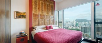
With the increasing availability of the Internet and its resources, representatives of various professions began to do part of their main work not somewhere in the office, but right at home. Any successful person, be it a politician, businessman, writer, designer or architect, must have a separate room in his home - an office. This is a room that fully meets the needs of the owner and is equipped for the most comfortable and productive performance of certain activities.
Color in the interior of the office
The color design of a home office is a purely individual matter, directly depending on the taste preferences of the owner and the nature of his activities. The color design is determined not only by the characteristics of a particular interior style, but also by the psychological influence of the desired palette on a person. By choosing the right shades, you can create ideal conditions for both complex, painstaking work and creative activity.
Choosing a color palette for the office
Managers of many companies do not attach much importance to office design. The walls are painted in neutral colors - gray, white, beige, or wallpaper of similar colors is glued. Others, on the contrary, want to make the office unusual - they invite a designer who develops a unique project, after which the room is decorated. According to experts, the second option is preferable and will pay off faster even at high costs. The advantages of decorating an interesting interior in the workplace are:
- increasing the working capacity of employees;
- increasing the company's attractiveness to clients;
- growth of the company's rating due to improved image.
In many companies, profits even increase - the beautiful design of the offices has such a beneficial effect. The point is to choose a color or combination of colors that suits all parameters - only then can the repair be considered successful. There are a number of principles that should be followed when choosing shades for walls:
- Direct impact on humans. The tone of the walls should be constructive, without irritating or straining the eyes of employees and visitors.
- Cabinet dimensions. Black and other dark colors visually make the room smaller. On the contrary, white and other light colors “expand” the cabinet. Matte surfaces look good in spacious offices, glossy ones - in small ones.
- Illumination. If the room is poorly lit, dark colors are not suitable for the interior. In offices with large windows, even darkened walls will not disturb the harmony of light and shadow. By the way, the lack of light can be compensated for by sconces, chandeliers, floor lamps, and spotlights. Traditionally, warm colors are used in rooms with windows facing north, cold colors – to the south.
- Stylistics. Some style decisions imply or exclude the use of certain colors in the design. For example, a loft includes walls and interior items in beige, brown, and gold tones; modern – a combination of black, white, gray, and silver. The avant-garde style is based on combinations of bright, rich shades - light green, cherry, lemon, etc. You also need to take into account the color of the furniture - it should be in harmony with the chosen shade of the walls.
- Design rules. Experts advise painting offices, corridors, and halls in two main colors, while allowing moderate accents of a third color. The first tone should be about 60%, the second - 30%, the third - no more than 10%.
- Colors and shades. An office in which the walls combine a combination of a base color and one or two of its tones or halftones looks great.
The right color for design
Designers approach the issue in a comprehensive manner. By inviting an experienced specialist, you can be sure that he will choose the right color for the walls. It will take into account all the nuances - lighting, shade of furniture and finishing materials, size of the office and windows, tone of the ceiling, its height.
It is preferable to visually expand the boundaries of the office - this makes the work of employees more comfortable. It is also worth finding out the wishes of the manager and employees, because they will have to spend a long time in the office every day. And, of course, the designer takes into account the chosen and agreed style. Features of style solutions are as follows:
- Reception. This is the “face of the company” and attracts customers, so the reception area should be catchy. Wood-look wallpaper, bright colors or accents will look good here.
- Employees' offices. It is important to adhere to the same style of rooms, although depending on their size, shades of the same color may darken or lighten.
- Head office. It prefers a strict or “advanced” style without frills - classic or modern, minimalism.
- Kitchen and sitting area. Here it is better to use light, relaxing, unobtrusive colors that will help relieve the stress of the working day.
Psychologists' opinion
The color palette used for office renovations can have a profound effect on a person's mental health. Before you paint the walls, it is better to check with experts in this field. According to the science of psychology, colors affect employees in the following way:
- Bright, catchy colors interfere with concentration, distract from the work process, and in some people they provoke migraines. At the end of the day, the employee feels tired due to overexcitation of the nervous system.
- Calm tones increase performance. They do not disrupt the processes of memorizing and analyzing information.
- The combination of warm and cold tones has a beneficial effect on the psyche of employees. This is a good option for painting walls in an office.
Psychologists' favorite color is green. It is not only visually pleasing to most people, but also increases the concentration of those who work with computer equipment. Green is also good for vision. Too dark the color of the office walls can suppress the mood, depress, and provoke depression - there should not be a large number of such tones in the interior.
Design tips
When choosing the color design of your office, in addition to personal preferences and recommendations from psychologists, you should adhere to a few simple design rules:
- The more modest the size of the cabinet, the lighter the base color should be;
- For the south and east side, with a sufficient level of natural light, you should choose neutral or cool shades;
- Warm colors are preferred in cool or dimly lit rooms;
- Dark rooms will become cozier by using a light color palette;
- You should always select several additional ones to complement the main tone.
Inappropriate colors in the office - list
Pink and crimson colors are not used for offices. The first one puts you in a frivolous mood, and the second one even generates aggression. Gray is considered a neutral color and will generally not have a harmful effect. But it is so calm and boring that it can reduce employee productivity. In offices where there is an abundance of gray, employees usually do not have a clear motivation to work, are passive, and lack initiative. Gray is best used as an additional color - along with a more cheerful one.
Black is also not suitable for painting walls, except as a bright spot or accent. If there is a lot of it, it can provoke negative memories and depress a person. The abundance of dark blue and purple leads to depression and often causes conflicts between office employees. Psychologists have two opinions about the color yellow. They say that yellow pleases the eye and lifts the mood. But it does not allow you to concentrate on solving complex problems, so it should not be used in large quantities.
Recommendations for the design of various office premises
The first thing the client will see is the reception area.
It should cause only a positive impression and be memorable. You can often find rooms decorated with wood (or wood look) in combination with bright colors or details. In the manager's office, everything should speak of stability, reliability and confidence. Therefore, it is customary here to stick to classic, minimalist or modern interiors without an abundance of unnecessary details.
The remaining offices are usually decorated in the same style; the main criterion for choosing the color of the walls is the size and lighting of the office.
In the area for eating and relaxing, it is recommended to use calm, unobtrusive shades that will distract you from the hustle and bustle and help you relax during a break.
Colors for the office and their variations
Below are some basic guidelines for using different colors in offices:
- White. It will visually enlarge the space, provide a feeling of efficiency and severity, but to a significant extent it becomes faceless and can evoke sadness. It is better to combine it with dark tones or add bright details - red, green, blue.
- Brown. This color evokes a feeling of security, but is not suitable for every office. Where clerks, accountants, economists sit, and a lot of paperwork is processed, brown walls can cause depression. On the contrary, it will look perfect in the investigator’s office. Brown is always popular with visitors and those employees who are not in the office all the time.
- Blue. Perfect for knowledge workers, “refreshes” thoughts. But you should not darken it, since blue does not have such a beneficial effect on the body. Blue combines well with beige, white, and yellow.
- Red. Color invigorates and encourages action. It is not used only in offices where negotiations are taking place - there is a risk of conflicts and misunderstandings. Red is ideal for employees whose work requires a creative approach.
- Orange and peach. Positive colors increase productivity. Too caustic tones irritate the eyes, so you should choose calmer shades.
When choosing a color for office walls, you need to take into account the possibility of painting. It is not necessary to make the room dull and monochromatic - bright elements may well appear on the walls, enlivening the atmosphere. It is best to use green, blue, peach colors, but variations are possible according to individual preferences and style.
How wall color affects the work environment
Any shade affects a person’s emotional state and performance. Therefore, you need to choose it very carefully, taking into account a number of nuances and features.
White
This color is perfect for small spaces. It helps to get in the mood for work and constantly keeps a person in good shape. This color is perfect for finishing walls and ceilings. At the same time, it can be safely combined with other shades. The most suitable options include gray, green, brown tones.
The white color itself has many variations - from frosty snow to milky. Thanks to this, designers can use it to realize their wildest fantasies.
Beige
This color is versatile. It has a mild calming effect, giving a feeling of stability and security. This shade can be used not only for decorating walls, but also for finishing the floor. At the same time, it is allowed to use bright elements in the interior that will not overload the overall design.
In combination with white panels, the beige shade helps to emphasize the sophistication and beauty of the furniture without overloading the space. A very successful combination can be achieved if you combine beige with gray or blue. This will help make the room truly luxurious.
Green
Green, a color that calms the nerves, is ideal for office decoration. The use of this shade has been proven to reduce sensitivity to noise, increase productivity and help cope with eye strain.
To decorate an office space, it is permissible to use a variety of types of greenery - shades of apple, forest moss or lime.
As a complement to this background, it is allowed to use white and gray interior elements. Woody brown tones would be a good solution.
See also
How to quickly paint a metal fence, choice of composition and application rules
Yellow
This color saturates a person with energy. It has an invigorating effect and increases intelligence. It is important to consider that constant stimulation of the nervous system can be tiring. Therefore, when decorating office spaces, it is worth using not too bright variations of yellow.
Gray or brown shades are suitable as additions to this palette. An equally good solution would be to use soft tones of green.
Orange
This color looks very cheerful. Psychologists say that it helps improve overall tone and stimulates the imagination. This shade is perfect for creative individuals who constantly need to generate creative ideas.
Expert opinion
Zakharova Irina Yurievna
Cleaning professional with 15 years of experience. Our best expert.
Ask a Question
In offices, this rich color should be diluted with a more neutral palette.
As additions, you can safely use white, gray, wood tones. The orange color scheme should be used to decorate cold northern rooms. On the south side this color will not look very appropriate.
Blue or cyan
The blue tint increases productivity and activates thought processes. With its help, it is possible to gently calm the nervous system and create a strict atmosphere.
Blue tones are perfect for people whose work requires high concentration and precision. However, the use of blue tones for office decoration requires extreme caution. In this case, lighting is of particular importance. Properly selected lamps will help avoid attacks of melancholy and depression.
Grey
This shade is considered the true embodiment of minimalism and neatness. It is ideal for decorating office spaces.
Gray color is distinguished by aristocratic restraint and calm. Thanks to this, it allows you to tune in to achieving your goals and increase concentration. This allows people to successfully perform the most difficult jobs. As additions to this palette, it is worth using white or orange shades. An equally good solution would be greenish tones.
Brown tones
Such shades evoke strong associations with stability and material well-being. The wood-brown palette is ideal for decorating office spaces.
See also
Features of paints for PVC boats and how to choose the composition, application methods
All shades of this spectrum have a calming effect on people and help them concentrate on making meaningful decisions. Modern interiors often use a striking contrast between a light background and dark brown furniture.
Violet
This shade helps to awaken imagination. Dosed use of this color is suitable for decorating the work area of representatives of creative professions. It is best to combine this color with white. A good combination is obtained with ashy shades.
Red or pink
Using red or pink tones to decorate work spaces is not considered the best option. The red palette looks very active. With prolonged exposure to a person, it can cause causeless irritability.
At the same time, the pink shade symbolizes dreaminess and romance. Such feelings do not increase productivity at all. However, people who love these shades can use them. However, this must be done in doses.
What psychologists say
Taking into account the psychological impact of colors is very important, so it is recommended to seek advice from specialists. Here are examples of how color affects a person: too bright and flashy shades overexcite the nervous system.
This leads to a drop in concentration and productivity, headaches and overwork. The opposite effect is inherent in calm tones, they help to concentrate and improve analytical abilities and memory. The presence of warm and cold colors in the office interior has a beneficial effect on its staff, this is a good color solution.
Green is a favorite color among psychology experts. It improves memory, vision, concentration while working with a computer, has a calming effect on the nervous system and is visually attractive.
Briefly about the main thing
Of course, office productivity depends on the boss and his ability to properly organize the work process. But well-chosen room design also plays a role in setting the desired rhythm. White and gray colors help create a business atmosphere, but modern managers are not afraid to experiment and keep up with the times. They listen to psychologists and hire experienced designers to improve the model to help them make money.
Source
Not the most suitable colors
There are colors the use of which is considered inappropriate for decorating a business space. This is pink and raspberry. The first helps create a frivolous atmosphere. The second gives rise to aggression.
Gray color is the calmest and most neutral. And it is often used for the designated purposes. But practice shows that clerks and programmers, forced to stay in a room with gray walls for a long time, quickly lose interest in work, begin to get distracted, and spend their working time irrationally. This happens because they become bored and their motivation fades. In gray offices, employees are very passive and lack initiative. Therefore, it is necessary to dilute the base tone with something more cheerful.
Black is not suitable for painting office walls. It depresses and provokes bad memories. Deep blue, dark purple leads to depression. It has been noticed that conflicts often break out in rooms with such decoration, and they interfere with coordinated work.
There is a lot of controversy surrounding the color yellow. Some believe that it evokes a positive mood, pleases the eye, and warms with its warmth. But psychologists point out that the color yellow prevents a person from focusing on solving the task at hand. If you are constantly brainstorming in your office, yellow walls will interfere with your work.


