With the right combination of colors in the interior, you can improve a person’s emotional state. The abundance of your favorite shade in the design of a room does not always become a successful design solution. Some tones tend to irritate or cause melancholy and depression. The article contains information on methods for creating a harmonious interior with the basics of color therapy, as well as tips on selecting tones in various styles.
What you need to know about colors and shades
The best place to choose shades is the kitchen space itself. Lighting during the day and evening has a huge impact on how color is perceived. At different times of the day and when switching from natural to artificial lighting, some complex tones can change their appearance for the worse.
Cold and warm shades
For any color, in addition to brightness and saturation, there is one more characteristic: perception temperature, which divides the spectrum into the following two groups:
- All shades close to yellow are perceived by a person as warm tones that release energy and create a positive and bright space. Among them are beige, red, orange, and light green colors.
- Shades containing blue notes belong to the cold range. They are perceived as calm tones, relaxing and creating coolness. They include blue, violet, turquoise paints.
Each individual color has its own palette, containing both warm and cool tones. For example, if we consider the variations of pure red, then all its shades mixed with blue (berry, raspberry, burgundy) will be cooler than the main tone. The same range with a hint of yellow will turn out to be warm. It includes terracotta and orange.
Achromatic colors
Paints that do not have a rainbow tone are called achromatic. These include white, gray and black colors. These three shades react predictably to streams of light:
- White completely reflects everything: rays that reach the surface. This property allows it to be used in tight spaces to visually expand the space.
- Gray tones first absorb the beam, then reflect it without changing the color spectrum, affecting solely the intensity of the flow. It is gray shades that designers use when creating a neutral background for a colorful set.
- Black tends to absorb sunlight, so its abundance in small kitchens leads to feelings of crampedness and discomfort.
A purely achromatic combination in the interior without adding bright color nuances and details may seem boring. White and gray tones are most often used as background colors. Black trim can add impact to the design of a room and highlight the dignity of the style. The monochrome palette is easily enlivened with contrasting and ultra-bright accents.
Psychology of color and combination of shades
Color combinations can not only create a unique stylish environment, but also influence the emotional state of people in the room.
Orange
This is a very positive color, conducive to confidential communication. Therefore, it will be very appropriate in the kitchen, where the whole family often gathers. Any shades of orange except orange:
- increase attentiveness;
- promote concentration on solving a problem;
- increase labor productivity;
- increase appetite, so their use in the kitchen is recommended in cases where the owners do not have problems with excess weight.
Such accents in moderation will look great in high-tech, modern and minimalist styles. For a warm combination of orange with green and brown, a white or gray background is suitable. But its proximity to blue, purple or black also looks harmonious.
Red
It is called the “color of life” for its resemblance to blood. The fiery shade adds excitement and passion to the interior. It is able to increase mood and appetite, and encourages communication.
To a person in a room with red surfaces, it seems that the room is warmer than it actually is. The secret lies in accelerating blood circulation under the influence of the color of fire.
Too much red suppresses the will and mood, and can cause irritation and aggression. The classic combination is a white and gray background with red spots. It can be used when decorating a kitchen in a modern style. A deeper and more meaningful option could be a combination of red and gray tones with black decor.
We talked separately about the design of red kitchens here.
Yellow
This is the warmest color, bringing boundless optimism. It is associated with the sun and dandelions, creating a joyful atmosphere. When used in moderation, this shade can brighten up a dark kitchen with north-facing windows.
The abundance of rich yellow color increases nervous excitability, so irritable people are better off not using this tone in the interior. Sunny shades are combined with warm reds, wood and herbal tones. Lemon accents will dilute the monochrome interior.
Read more about yellow kitchens in this article.
Brown
This is the color of reliability, security and calm. It is most characteristic of the classical style, but will also find its place in modern kitchens. The brown palette looks harmonious with many colors, for example, turquoise, beige, yellow, orange, green.
Grey
The noble background will highlight even the most modest decoration of the room. It is able to highlight the brightness of colored details and create a harmonious and calm interior. Without contrasting spots it can be depressing.
Looks great with matte surfaces and steel elements in a high-tech high-tech style. Combines with almost the entire palette, looks luxurious with a velvety burgundy shade.
Black
This is the deep color of night, riddles and secrets. Its excess can create a gloomy mood and create tension in the atmosphere. Moderate use of black will add contrast and elegance to any interior. Its combination with gold is used in art deco and classic styles.
Beige
This is a warm, calming color that can be used to create a cozy and stylish kitchen. The most harmonious and calm combination is light brown surfaces with wood trim. A combination of beige with a blue or soft pink tint is considered interesting and memorable.
You can see very interesting design options for kitchens in beige tones here.
Green
The color of grass and nature promotes relaxation, relieves stress, relaxes and calms. Its diverse palette can be used in any style, but most often it is found in country kitchens. Contrasting and complex is the combination of a white or gray wall background with a green-violet set.
We have a separate article about green kitchens, full of photos and tips.
Blue
The heavenly color reflected in the forget-me-nots creates a feeling of coolness and depth. It is able to visually increase space, so it is often used to decorate small rooms.
The property of blue to reduce temperature should be used to balance in sunny southern kitchens. Its cool shade is combined with warm beige, brown, dark red, yellow and golden tones.
Lilac and purple
Mystical purple and charming lilac are not so often found in interiors. They are difficult-to-perceive colors that can distract attention and evoke a dreamy mood.
In small quantities, these tones will add mystery to the overall style. The shade is combined with white, gray, beige backgrounds, as well as with brown, red and black decorative elements.
You can see purple kitchens in all their glory in this article. There you will also find tips on arranging the space in such a room.
Pink
The shade of romantic love is associated with delicate rose petals. Its light versions will help create a charming, feminine interior. Darker tones such as fuchsia, raspberry or pale purple will bring energy and positivity.
The classic combination of pink and white is successfully complemented by monochrome, olive or brown accents. Combinations with blue or beige look interesting.
Pink kitchens are a very rare choice, but we have prepared a separate material on this topic. See what options there are for decorating a room in different shades of pink.
What shouldn't happen
Feng Shui allows some departure from accepted norms, but there are certain aspects that should be taken into account. For example, you cannot use the colors of an element that is opposite to the element of the kitchen area.
- South. There should be nothing from the element of water here. If you choose from colors - black, blue and light blue. Otherwise, it may negatively affect the energy of the room.
- North. Fiery shades are unacceptable here.
- East. In order not to suppress the energy of wood, metal should be excluded. Therefore, you should not use chrome elements, for example, handles, legs and others.
- West. Here everything is the opposite compared to the east: you need to exclude the tree. Let the facades be completely metal, however, such a solution may not be cozy enough. Therefore, wood can be replaced with glass, surfaces can be replaced with glossy ones.
Choosing colors depending on the style of the kitchen
Provence
Light colors in a French country setting create the impression of a sun-bleached room. Aged furniture can be decorated in warm versions of white (milky or ivory), beige or soft olive shade.
It is also appropriate to use blue, soft green or light brown colors in the interior.
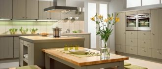
Modern
In classical modernism, soft tones predominate: ash, grayish-smoky, gray-blue and beige. A calm interior is enlivened by contrasting spots mainly from a palette of natural shades, such as the color of a scarlet rose, green grass or blue sky.
Typically, such accents are present on curtains and wallpaper, but they can be placed on the facades or apron of the set.
Scandinavian
The main color scheme for decorating a kitchen in this style is white. Its light versions (snow, vanilla, cream, white sand, baked milk) perfectly complement deeper colors (graphite, asphalt, pure black), and also effectively highlight bright accents (blue, turquoise, green or yellow).
We have a very detailed article on Scandinavian kitchen designs. It is full of modern photographs and advice from experts.
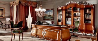
Classic
In this style, the traditional combination of a pastel background with gilded elements is traditional. Beautiful and rich decoration is most often dominated by the colors of valuable wood species, such as oak, beech, walnut or wenge, and the calm shades of natural stone.
Read about classics in kitchen interiors here.
General recommendations
A lot of activity is concentrated in the kitchen, so Yang energy predominates in this room. And here it is important to achieve the right balance of energy.
Initially, this room is dominated by two opposing elements: fire and water. After all, one of the main appliances here is the stove and sink. It is important to smooth out this confrontation. Therefore, it is important to choose the right positions for these devices, choose the right color scheme, taking into account the recommendations of Feng Shui.
Choice of color depending on the direction of the world
Kitchens with windows facing south
Such rooms are usually saturated with natural light. In summer, the hot rays of the sun penetrate the room from the south window all day long. To add coolness to the interior, it is better to base the design on cool tones (mint, turquoise, blue, blue), as well as the intriguing purple color. The background for such interiors is traditionally white.
North facing kitchens
A window in such a room is almost unable to catch a ray of sunlight, and therefore, to create a comfortable environment, it is advisable to give preference to warm and desaturated colors, such as dim yellow, soft orange, terracotta, cream and calm light green.
The room will become brighter if you use variations of white as a background, for example, ivory or boiled milk.
East facing kitchens
With this arrangement of the window, light enters the room from morning to mid-day. In the interior design, the predominance of soft, cold tones is appropriate: blue, grayish-green or turquoise. Warm accents will act as companion flowers: yellow, orange, scarlet or herbal.
West facing kitchens
So that in the early morning, when the sun is not yet shining through the window, the kitchen does not seem too cold, it is better to choose warming tones, for example, beige, calm yellow, terracotta, pine, shades of coffee with cream.
To add some color, you can add pale blue or turquoise textiles, a blue vase and a bouquet of forget-me-nots.
Suitable color for a miniature kitchen
If the room is small, then the basic rule in interior design should be the following: more light colors on the ceiling, floor and walls.
In such an environment, even a bright kitchen set does not hide the space. However, if the furniture is made in pastel colors, the room will seem spacious and bright. To add expressiveness, you can use decorative elements that can be easily decorated in bright colors. This could be chair covers, a tablecloth on the table, or window curtains.
The entire kitchen should not be painted in sterile white, as the room will look like an operating room. It is better to combine it with pearl gray: this design will look stylish and expensive.
Registration results
Using Feng Shui recommendations, you can decorate your home in the best way to ensure its well-being. At the same time, you can navigate the choice of color, which very often becomes a dilemma for many. Feng Shui helps you correlate your views, feelings, and intuitions with a valid, proven philosophy. This is the standard by which interior design can be built. It is important to take into account the energies, or rather their balance, then harmony can be achieved. In this case, you will have to take into account the location of the kitchen in relation to the entire apartment.
And in order to get additional ideas, you can look at photographs of already created premises, take into account the experience of others, then it will be easier for you to successfully implement your plans.
What colors are suitable for the kitchen-living room
To decorate a spacious room, you can use the entire color spectrum, choosing different options taking into account personal preferences. Even when visually dividing the space into a cooking area, a dining area and a sofa area, it is necessary to maintain color harmony throughout the entire room. For example, a dark blue shade of the work surface should be present in the form of delicate decor on the sofa cushions and the same tone on the stools along the bar counter.
A white kitchen with milky walls will be complemented by a black dining set, while the floor is decorated in a light wood color.
An interesting and stylish combination is the arrangement of natural stone with wooden surfaces and regal burgundy in the interior.
More general useful tips
If you follow the philosophy of Feng Shui, it is worth considering the following nuances:
- All unused items should be removed: thrown away, donated, sold. If there is some thing that is used extremely rarely, it is valuable to you, then you can hide it, but away, somewhere in the farthest corner of the closet.
- Cleanliness and order should be maintained. It’s not just about clean dishes, accessories, and so on; there’s no need to fuss or quarrel in the kitchen. Disorder threatens financial problems in the family. It is believed that it entails trouble.
- Damaged items should be gotten rid of. Their use or storage is considered unacceptable.
- Foreign objects must be removed, otherwise there will be an obstacle to the flow of Qi energy.
- It is necessary to eliminate or minimize the number of open shelves and sharp corners.
- It's best to leave nothing on the countertop between cooking sessions. It must be clean and well-groomed.
- You need to combine products and items. For example, plates need to be stacked with plates, glasses with glasses, and so on.
- Water should not leak, wiring and lighting elements should be in good working order, and knives should be sharpened.
- The more working burners, the more positive energy enters the house.