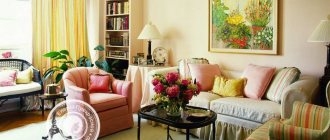
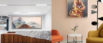
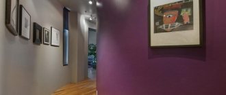
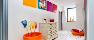
When developing the design of an apartment and carefully, down to the smallest detail, thinking through the interior of each room, for some reason everyone forgets about the hallway. But in apartments, especially old-style ones, this is one of the most difficult rooms to decorate. After the most ideal renovation, the interior of the corridor often remains soulless and cold. The missing element that will give the room expressiveness can be paintings for the hallway. They will transform a limited space, make the interior of the corridor complete and give the entire home uniqueness.
The role of paintings: mood and correction of space
Based on how carefully and in detail the interior of the hallway is designed, the guests’ opinion about the inhabitants of the home is formed. But still, the main role of artistic paintings is to create a good mood. They are needed to please the eye and evoke positive emotions. If you want to look at the canvas again and again, then the main goal has been achieved.
The entrance area can be simply decorated, and that’s good. And you can further adjust the space if the paintings in the hallway on the wall are selected in the right way.
Modular painting in eco-style Source design-homes.ru
So, when choosing, it is important to balance the size of the room and the future decor. If the hallway is modest in size, it is better to decorate the walls with several small paintings. They will fit perfectly into the setting and will be perceived as parts of the whole, especially if you take care of the same (or matching style) frames.
If you want to raise the ceiling, opt for narrower, vertical patterns. A large-scale canvas will make a small room even more cramped and visually reduce the height of the ceilings. In addition, it is difficult to evaluate it when viewing it from a distance of a meter and a half. The lucky ones who have a spacious hallway have a wider choice of suitable sizes and ways of placing paintings.
Costume collection Source i.pinimg.com
In addition to choosing the right size, correction methods using paintings include the following methods:
- Taking into account the color palette of the canvas. Warm (red, yellow, brown) shades create coziness, but at the same time visually narrow the space. Cool (blue, white, green) shades have the opposite effect: they expand and refresh the interior.
In warm colors Source aviarydecor.com
- Using the contrast effect. On dark walls, a composition of small light canvases looks good (the opposite is also true). The hallway receives additional structuring, which is perceived by the subconscious as calming.
- Using Feng Shui methods. In the Eastern tradition, the presence of a mirror is considered important. Its location should contribute to the correct flow of qi energy, the same applies to the plot of the paintings. The relative position of these objects is allowed, in which the canvas is reflected in the mirror. Followers of the teaching claim that if the plot is chosen correctly, it will attract harmony and success to the house.
Strictly according to Feng Shui Source www.initial.com.ua
- Using a mirror. Even if you are not a follower of oriental practices and the placement of paintings in the hallway according to Feng Shui, the canvas reflected in the mirror creates a volume effect, which will not hurt in a cramped corridor.
- Most corridors suffer from a lack of natural light, so it would be correct to organize lighting for paintings. This can be either special LED lighting or regular wall sconces. To prevent the image from fading, it is protected with anti-reflective glass.
Loft in the interior Source static0.abitant.com
See also: Catalog of companies that specialize in the production of finishing materials and glazing
How to choose a painting: 6 subtleties of the process
Size is not the only thing that influences the choice of canvas. It is equally important to take into account points that will affect the result and overall impression. When choosing a painting, take into account the following nuances:
- Trusting your inner voice. If you are afraid of making the wrong choice, focus on your inner feelings. It is important whether you have internal acceptance or, conversely, non-acceptance of the art object.
The plot with the balcony Source homeli.ru
- Pictures in frames look harmonious if their size is proportional to the size of the wall. In general, the exhibition should not occupy more than a third of the free space. In a cramped corridor, it is better to limit yourself to one or three frames, which are placed at eye level.
Home gallery Source i.pinimg.com
- The canvases are selected according to the style of the room. The components of the right painting are not only the right colors, but also the right theme.
When space is tight Source lixmebel.com
- The decoration details of the hallway should be positive, and the same applies to the color scheme of the paintings. It is worth abandoning dark shades and gray (“dirty”) blurry images if this does not play into the style.
- To create coziness, it is not necessary to use only muted shades. The desired mood will also be supported by richer tones: green, yellow, lilac, diluted with white.
In contemporary style Source cdn.incollect.com
- The color, style and texture of the frame are of great importance. It’s good if the frame of the picture is combined with other interior elements, maintaining the unity of style. If you plan to hang several pictures, it is better to choose frames from the same material. This rule can be broken if you know how to combine different frames with each other.
For lovers of abstract painting Source i.pinimg.com
Color spectrum
The main requirement for the painting is that it must be combined with the design of the hallway itself. It is best to match it to the overall color scheme of the room. It is not recommended to hang images in dark colors in the hallway.
But if you want the picture to be noticeable against the background of the hallway interior, then follow these rules:
- if the hallway is made in bright colors, then choose images that are lighter than the main palette or pastel colors;
- if the design of the room is dominated by pastel colors, then you can choose any bright picture to your taste.
Types of paintings
Whether you need paintings for a corridor or a spacious hall, the question of choosing the type of canvas will definitely arise. In addition to standard canvas printing, the following options are available to decorate the entrance area:
- Copyright. Original paintings, painted in oil, watercolor or pencil, add a touch of luxury to the interior. To demonstrate taste, you don’t have to be able to draw yourself. Art salons and theme fairs offer works of varied style; many canvases are very aesthetic and cost a relatively small amount.
Design with accent details Source izbushkinet.ru
- Poster. A popular type of decor, the plot of which can include comics, motivational inscriptions, and humorous drawings. The graphically clear design of the poster will decorate any modern interior. Often several posters in identical neutral frames are hung on the wall; the composition does not have to be symmetrical.
Posters Source static.wixstatic.com
- Embroidery. An embroidered picture in a suitable frame gives the room a special flavor, and therefore is used in strictly defined styles (country, Provence). Embroidery is done in different styles (usually satin stitch or cross stitch), and, like any hand-made decor, it greatly enlivens the decor. Silk embroidery in the Chinese tradition looks impressive.
In pastel shades Source design-homes.ru
- Modular. The image consists of separate sections that are located side by side, without changing the order, but often with horizontal and vertical offsets. Despite the fact that the picture consists of fragments, it looks solid and looks stylish. The theme of modular compositions can be anything, from a natural landscape and city view, to a still life and a photo of your favorite dog. You can make interesting decor with your own hands from photo wallpaper.
In Provence style Source remont-samomy.ru
- Panel. An impressive result can be obtained if you apply an image to photo wallpaper. Such a panel on the wall (in 3D format or with perspective) will help visually expand the space and make it more interesting. Natural images (for example, the edge of a forest), as well as recognizable places, pyramids or the Eiffel Tower, look attractive.
Panel Source dizainexpert.ru
- Fresco. Classic frescoes were created using a strictly defined technology - they were applied to wet plaster. Today, it is understood as wall painting with paints applied in different ways (brush, airbrush). For hallways, which are dark rooms, frescoes in light shades are suitable. The image material must be durable enough to withstand regular maintenance.
Fresco Source walldeco.ua
The role of photography in the interior of the hallway
Since the advent of digital technology on the market, a tendency has arisen to decorate every free corner of the apartment not with hand-made works of artists, but with photo wallpapers or posters. Photo images are relevant for hallways with a simple design. Modern technologies make it possible to print high quality pictures. With their help, for little money you can give your front room a memorable look.
Remember that the scenes themselves depicted in the paintings will not significantly change the appearance of the hallway. They can be changed periodically.
Plot and style
When choosing paintings for the hallway, one takes into account not only the area of the room and the prevailing color palette. Both light shades and its plot make a work of art positive; designers recommend choosing a theme based on the following rules:
- Dark themes with natural disasters and war scenes, as well as destroyed (even picturesque) buildings and broken things should be avoided. Subconsciously, such images cause a negative reaction.
Combination of frame and furniture color Source stroyka-gid.ru
- It is worth abandoning images of older people, even if it is a reproduction of a world-class painting. The same goes for drawings with a lot of details - they belong in the living room or office.
- Abstract drawings are also not suitable for everyone. They often cause the nervous system to tense up rather than relax, as is the case with classical landscapes and still lifes.
Lilac abstraction Source i2.wp.com
Paintings are a very diverse and flexible accessory to use. They are easy to match to a particular style if you remember the following rules:
- Classic design. In the spacious hallway there will be luxurious reproductions of paintings by Russian and foreign masters from different eras. Sea and forest landscapes, city sketches, portraits of people and images of animals are welcome. Graphic drawings also look good.
In a classic style Source i.pinimg.com
- Minimalism and modern laconic styles (Scandinavian, loft). Abstract subjects and graphic (often monochrome) images of trees, objects, and city landscapes look good here. Vivid designs, such as birds or flowers, are also possible - it all depends on the context.
In Scandinavian style Source cdn6.roomble.com
- Country styles. For Provence and country, the most acceptable natural motifs are images of birds and animals, rural landscapes, flowers, and household utensils. The palette of designs is slightly muted, and frames are chosen to match it - simple, wooden, perhaps with an antique effect.
With French charm Source evg-crystal.ru
- Country estate style (English). The respectable and elegant style of a country house will help you create paintings depicting hunting scenes, still lifes with trophies, horses and dogs. Classic paintings would also be appropriate; they are enclosed in characteristic wooden frames covered with patina and gilding.
Elegance itself Source opora-stroy.ru
- Pop Art. All kinds of posters, photographs and stylized reproductions in the spirit of the unforgettable Andrew Warhol or the no less significant representative of modern art Roy Lichtenstein are suitable. The absence of frames will add a fashionable touch to the composition.
Pop art Source homify.com
Place for handmade creations – small corridors
Pompous canvases are spectacular in spacious passers-by. And if you want to present your own creation to others, be it embroidery with beads or thread? Such works have a place in the interiors of small corridors with a certain stylistic solution.
Modern design implies clear lines and minimalism. Therefore, in a laconic hallway setting, such a hobby will look out of place and will cause dissonance of perception. Hand made looks more advantageous in country interiors, chalets, Provence and other rooms where the emphasis is on national flavor.
But a balanced approach is also important here. A corridor is a space with a high level of pollution, so hanging a painting made using the kanzashi technique is inappropriate. She will quickly lose her original attractiveness.
Advice! It is optimal when the embroidered fabric in the hallway interior is protected by glass or plastic film.
Feng Shui: oriental canons on the walls of the hallway
The basis of Eastern teaching is knowledge about the flow of qi energy. It says that the correct arrangement of objects in the house helps energy flow unhindered and harmonizes the life of the owners. If objects are not in the prescribed places, the flow of energy is blocked, which negatively affects health, success and other components of life.
Bright decor in a beige interior Source i.pinimg.com
Feng Shui experts advise paying attention to images of water. Paintings and photographs depicting moving water are best suited: an endless sea, a stormy mountain stream or a waterfall. The fact is that water symbolizes the flow of pure qi energy, and helps it flow along the waves of life, lifting the owners of the canvas to the crest of success.
The more water, the better Source st.hzcdn.com
Based on the same idea, images with a calm lake or forest swamp should be avoided - they can provoke complete calm in household affairs. Feng Shui paintings for the hallway with the following content will also be favorable:
- Marine theme. A proud sailboat and mysterious sea shells will support the flow of chi in the house, provided the overall positivity of the picture.
- It is not recommended to leave a blank wall opposite the entrance. So that luck and prosperity do not slip out, they remain in the house, they are attracted by the right image. An excellent option would be flowers or a still life with bright fruits.
Opposite the front door Source cdn.woodynody.com
- One of the most favorable images for the entrance area, bringing prosperity, is the symbol of life - a tree, or its fragment, for example, a flowering branch.
- Bright colors and scenes with positive energy are welcome in the entrance area. To activate chi energy, a dynamic landscape with a sunrise (placed on the eastern wall) or a philosophical image of late autumn (on the western wall) is suitable.
Poppies Source st.hzcdn.com
Rug
Choosing a rug for the lobby according to Feng Shui also needs to be done by adhering to a number of rules. The door covering should be in harmony in style with the front door, but be of a different color and texture from the general flooring material. Additionally, to attract Qi energy, you can lay a special rug near the door, placing three coins with the image of Chinese characters on a scarlet thread under it.
If the door is located on the north side, shades of yellow, blue or white will do. For the southern direction, green or red colors are used. In Feng Shui, the East is associated with green and brown, while the West is associated with silver and white. Among the materials for a doorway, wood is most preferable, since the solid wood prevents the penetration of negative energy.
Light support for paintings
Most hallways do without daylighting. Of course, light colors are often used for their decoration, and mirrors and mirror surfaces are used for decoration. But in order for the paintings not to go unnoticed and to be successful, additional lighting will be required.
Vertical paintings with backlight Source design-homes.ru
Lamps will help create suitable conditions, and it is important not only to choose good accessories, but also to find the right place for them. When choosing, you must also take into account the type of fastening of the canvas. If the canvas hangs on beams (there is no gap), it is preferable to use spots that provide bright, directional light. If the frame is fixed on cables, a special thin lamp that is attached to the wall above the picture will help.
In a narrow corridor Source yandex.net
What should you give up?
Every home has its own traditions: some people like to make a photo gallery of their relatives, entomologists like to show rare butterflies, archaeologists like to show fragments of ancient dishes. From a Feng Shui point of view, this is not worth doing.
- Photos of loved ones or celebrities who have passed away evoke not only admiration, but also sadness and sadness. Such works can only be hung in the work area as recognition of merit and an incentive to achieve the goal.
- Military battles, necromancy, themes of murder - such paintings have no place in an apartment, these are paintings for museums and exhibition galleries. The only place where battle themes are appropriate are sports halls.
- Feng Shui recommends removing cracked and broken objects, furniture, and dishes from the interior. And they shouldn’t be in the paintings either. A crack in the mirror is a crack in the path of life.
- Abstraction carries the same energy: uncertainty, harshness, emotional explosion, confusion. There is no pronounced negativity, but there are also few positive emotions.
- In the bedroom it is not recommended to hang frames with dried butterflies and beetles, flowers, reeds - dead plants and insects carry negative energy, even if they are very rare and very beautiful.
- But it is also not recommended to place a drawing of a bag of money in the bedroom. It is believed that all family values will shift towards money, which can provoke scandals and quarrels in the family.
- You should not hang pictures that depict an odd number of objects: harmony is a pair.
- Behind you (be it at your desk or at the head of your bed) you don’t need scenes with the water element: a stormy waterfall or a quiet lake. Such paintings should not be on the southern walls of the house and office.
Briefly about the main thing
If you want to create a stylish interior in your hallway, you can’t do without paintings. They complete a room of any size, give it a personal touch and create a positive backdrop.
Properly selected canvases not only improve your mood, they can influence the perception of space, make a narrow corridor wider, and low ceilings higher. The color palette of the image adds coziness to the interior or, conversely, refreshes it.
To choose a painting, you need to trust your inner voice, taking into account the style of the hallway, the proportions of the wall and canvas, the material and texture of the frame. Don't forget about additional lighting and the potential of the mirror.
A variety of canvases are suitable for decorating a hallway: handwritten and embroidered, posters, frescoes and panels, modular options. If the style of the canvas is determined by the interior style, then the plot should be positive. It is worth abandoning dark themes; Abstract drawings will also not decorate every interior.
Feng Shui experts do not object to this approach, but supplement it with their own considerations. According to Eastern teachings, images of moving water, plants, as well as still lifes in rich colors will be useful for the entrance area.
Ratings 0
Placement nuances
The simplest placement option: one painting on one wall. In this case, you should adhere to the rule: the image should occupy no more than one third of the width and height of the free space.
The photo below is an example where the passport takes up a large area, but the size of the painting itself corresponds to the frame dictated by the “one third” rule.
Free walls can have different character and area. If we are talking about decorating a long wall of a narrow corridor, then it is most appropriate to place posters of the same size in a horizontal row. This will make the wall visually less long and boring. And the shine of the glass will create the illusion of space. The photo below shows options for corridors without furniture with posters hanging horizontally in a row.
When you have to hang several paintings of different sizes in a row, they are aligned along the central axis. But the implementation of such design ideas requires the designer to have impeccable taste and sense of style. The photo shows how interesting such solutions look in the hallway.
Modular paintings deserve special mention. Their elements can be of different sizes and proportions. All together, the parts of such decor sometimes form a complex configuration. Most often, you need enough space to see what the artist depicts.
By the way, there are artistic techniques thanks to which a work of art can be viewed at an angle, from different points of view. These are the options that are most suitable for use in a front room.
Along the stairs, which are found in two-story mansions, paintings are arranged in steps, for example, as in the photo below.
Above the entrance to the living room is a good place for desudeporte (a picturesque panel can be placed above the door). Thus, the height of the doorway increases, creating a solemn atmosphere in the room.
Often there is a need to fill an empty section of the wall above a cabinet, pouf or sofa. A shelf or any protruding decorative elements will interfere with the use of the seating area, but a flat picture is what you need. There are several options here too:
- one large piece;
- several small ones horizontally in a row. Moreover, the paintings can be either with or without frames. In this case, family photographs look good;
- vertically in a row. The photo shows paintings with hieroglyphs for a Japanese-style hallway.


